خانه انرژی صفر اثر گروه معماران لایفتینگز، ترجمهی لادن مصطفیزاده
 لانژ سبدگردان کاریزما، مجتبی میرحسینی، رضا اسلامی
گالری (شو روم) آیســـان، مجتبی هوشنگیانشیرازی


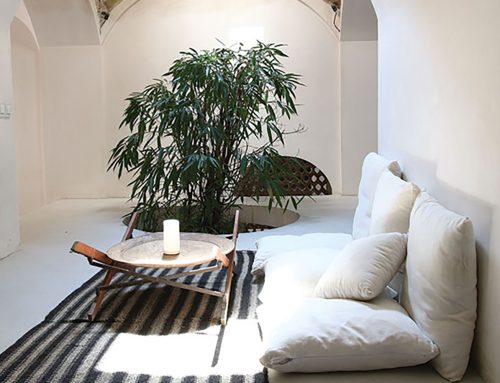
این شوروم در زیرزمین یک ساختمان به مساحت 400 مترمربع شکل گرفته است. کاربری قبلی این فضا که برای مدتی مورد استفاده قرار نمیگرفت، باشگاه بدنسازی بوده و کارفرمای پروژه تصمیم به تغییر کاربری بنا به مکانی برای نمایش مبلمان گرفت. مسئلهی اصلی تعریف سیرکولاسیون حرکتی در فضا بود تا به گونهای در اختیار بخش گالری مانند این فروشگاه قرار گیرد.
بعد از بررسی نمونههای موردی و تحلیل نقاط قوت و ضعف پروژهها مسئلهای که مشاهده شد، عدم همخوانی فضا با مبلمان متغیر مورد استفاده بود. لذا این انگیزه برای طراح به وجود آمد که به لحاظ رنگی و فرمی بستری ساده ایجاد شود تا کالبدی مناسب جهت خودنمایی هر مبلمانی باشد که در آن قرار میگیرد. در مرحلهی بعدی سعی شد با ایجاد عمق میدان، مخاطب ترغیب شود که کشفیات خود را در فضا دنبال کند. برای جداسازی فضا به جای استفاده از پارتیشنها از صفحههای تا شده به صورت دو وجهی برای تقسیم فضا استفاده شده است. نورپردازی فضا در راستای ایجاد یک کل واحد در بیان کانسپت پروژه که ایجاد حس تعلیق در فضا است، به صورتی شکل گرفت که تاکید بیشتری روی آجرها باشد. بدینگونه که نورهای خطی روی سطوح مجوف آجرها کار شد. با بالا بردن بخشی از صفحات از کف تمام شده سعی شد یک حریم مشخص برای مخاطب شکل بگیرد. مشکل دیگری که مرتفع شد، حذف سایههای مثلثی بود که با روشن شدن منابع نور در مرکز فضای چیدمان مبلمان به وجود آمد. همچنین سطوح معلق در خط فرضی در ارتفاع 120 سانتیمتری از کف، حامل یک سری نورهای تعریف شده است که منبع قابل رویتی ندارند. ذات طراحی فضای چیدمان مبلمان و به خصوص سرویسخواب این امکان را به وجود آورد که از یک خط فرضی در تراز 120 سانتیمتر برای برش فضا در این ارتفاع استفاده شود.
قسمتی از صفحات جداکننده بالای خط دید فرضی و قسمت دیگر زیر این خط قرار گرفت. این حرکت مرزهایی را ایجاد کرد که فضای پر و خالی همنشین شوند. برای ایجاد حس تعلیق در فضا، 90 درصد از نقاط تقاطع دیوارها به جای اینکه به عنوان یک خط در نظر گرفته شوند، از طریق یک نقطه به یکدیگر میرسند.
کتاب سال معماری معاصر ایران، 1401
نام پروژه: شوروم آیسان
عملکرد: گالری سرویس خواب
دفتر طراحی: استودیو معماری مشیر
معمار: مجتبی هوشنگیانشیرازی
همکار طراحی: هیلدا خزائینژاد
کارفرما: احسان کریمآقایی
مجری: ایمان قرهخانیان
سرپرست کارگاه: مریم نظری
زیربنا: 400 مترمربع
گرافیست: محمد کامل زاهدی، مریم شهابیحقیقی
پرزانته: هیلدا خزائینژاد، سعیده محمدی
عکاس پروژه: نوید عطروش
آدرس پروژه: فارس، شیراز، زرگری، کوچه 18، ساختمان مدیکال
تاریخ شروع و پایان ساخت: 1401
وبسایت: www.mo-shir.com
ایمیل: Moshirdesign@gmail.com
اینستاگرام: Moshirarchitects
Aysan Show Room, Mojtaba Hooshangian Shirazi

Project Name: Aysan Show Room
Function: Furniture Gallery
Company: Moshir Architects Studio
Lead Architect: Mojtaba Hooshangian Shirazi
Associate Designer: Hilda Khozaee Nezhad
Client: Ehsan Karim Aghaei
Executive Engineer: Iman Gharekhanian
Supervisor: Maryam Nazari
Area of Construction: 400 m2
Graphic: Mohammad Kamel Zahedi, Maryam Shahabi Haghighi
Presentation: Hilda Khozaee Nezhad, Saeedeh Mohamadi
Photographer: Navid Atrvash
Location: Fars, Shiraz, Zargari, Kocheh 18, Medical building
Date: 2022
Website: www.mo-shir.com
Email: Moshirdesign@gmail.com
Instagram: Moshirarchitects
This showroom is located in the basement of a building with an area of 400 meters. The previous use of this space was a gym and it was not used for a while until the owner of the project decided to turn it into a furniture showroom. The main problem was to define a motion circulation in the space to add this floor to the gallery section of the furniture store.
After examining the cases and analyzing the strengths and weaknesses of the projects, the problem that the design team faced was the incompatibility of the space with the variable furniture used. Therefore, this led the designer to create a simple platform in terms of color and form to respond to the display of variable furniture that is placed on it. In the next step, the depth of the field was tried to be created and the audience was encouraged to search for the space and each of them had their own personal experience in it. In the space design, instead of partitions, folded vertical surfaces are used to separate spaces.
The lighting of the space to create a uniform space and express the concept of the project, which is to create a sense of suspense in the space, was formed in such a way that more emphasis is placed on the bricks. In this way, the linear lights were placed on the uneven surfaces of the bricks. By creating a distance between a number of walls and the floor and not connecting the wall to the floor, an attempt was made to create a clear visual privacy for the audience. Another problem is that when the light sources were turned on in the center of the furniture arrangement, a series of shadows and light triangles appeared, which was tried to be corrected. On the other hand, the surfaces suspended in the hypothetical line at a height of 120 cm from the floor, carry a series of defined lights that have no visible source.
The essence of the design of the furniture arrangement space and especially the bed set made it possible for the designer to use an imaginary line at the level of 120 cm to cut the space at this height. and place a part of the separating plates above the hypothetical line of sight and the other part below the 120 cm level. This movement creates boundaries that are filled and empty together. To create a sense of suspense in the space, 90% of the intersection points in the composition of the walls were connected through a single point instead of being considered as a line.


مدارک فنی


مطالب مرتبط