
موزهی هنر معاصر دانمارک هِرنینگ، استیون هاُل، 2004
Steven Hall
Herning Museum of Contemporary Art, 2004

موزه داران و هُنرمندان، معروفند به اینکه دائما دربارهی معمارانی که قصد دارند با تحمیل احکام و ایدههای طرّاحی بزرگ خود بر مشتری علاقهمند، با هُنر به نمایش در آمده رقابت کنند، شِکوه سر میدهند. و به همین علّت، جای تعجّب نیست که وقتی استیون هاُل در سال 2005 در مسابقهای گزینش طرح برتر برای موزهی هُنرهای معاصر هرنینگ واقع در مرکز دانمارک شرکت کرد، از سوی هُلگِر رِنْـبِـرگ (Reenberg)، مدیر موزه، تذکّری جدّی به او داده شد که: «دستت برای انجام هر کاری باز خواهد بود، ولی تا آنجایی که آثار هُنری موزه تحت الشّعاع قرار نگیرد.»
موزه، که با سَرْنام (انگلیسی) خود، HEART [= قلب]، شناخته میشود، زمینی به مساحت 2/4 هکتار از پارک مرکزی بیـرْک (Birk Centerpark) را اشغال کرده؛ یک موزهی هُنر استثنایی، با پارک مجسّمه، مدرسهی طرّاحی، و یک ساختمان اداری مجزّا که زمانی کارخانهی پیراهندوزی بوده است.
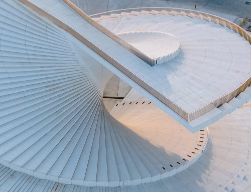
آنچه هاُل به شکل انتزاعی در ذهن خود پروراند، سازهای به مساحت 5600 مترمربع است که گالریهای هُنری در مجموع 1470 مترمربع از آن را به خود اختصاص میدهند. دو حجم مجزّا از بتُن پیش ریخته، هستهی درونی موزه را شکل میدهد، یکی برای نمایشگاههای دائمی، و دیگری برای نمایشگاههای موقّت، و متحرّک بودن دیوارهای سازههای سبُکوزنْ امکان نمایش آثار هُنری را در فضاهایی با چیدمان قائم فراهم میکند. اگر بتوان گفت، مشکلات معماری در سطح دیگریست. سقف به مثابه «گشتالت» ساختمان و مهمترین عنصر تعریف کنندهی معماری است؛ پنج پوستهی استوانهایشکل که کش آمده و پیچ و تاب خوردهاند، سقفی برآمده ساختهاند که بر روی گالریها و فضاهای جانبی شامل لابی، کتابفروشی، دفاتر اداری، کافه، کتابخانه و یک سالن کنسرت میلغزد و موج میخورد.


در فضای خارجی، دیوارهای برآمده و فرورفته در خم و قوسهای بالای سرشان پژواک یافتهاند. گرچه دیوارهای خارجی سفیدرنگ، که از بتن مسلح در محل ریختهشده ساخته شدهاند، از دور صاف و صیقلی به نظر میرسند، اما در نمای نزدیک سطح آنها را مخطط به چین و چروک خواهید یافت. برای دست یافتن به چنین افهی ضخیم و بافتداری، معماران غلطکهایی از روی گونیهایی با تار و پود وینیلی عبور داده، سپس برای ریختن، مواد چین و چروکدار را بر تخته سه لا منگنه کردهاند. با خشک شدن بتن و جمع کردن گونیها، به قول هال: «شما با چین و چروک هایی غیر تکراری مواجه خواهید شد.»
دربارهی شباهت اجزای بام برآمدهی بنا به آستین های برشخورده و تاشدهی پیراهن و شباهت بتنهای چروکدار خارجی بنا به بافت ساختاری پیراهن سخن بسیار رفته است ــ هر دو توصیف دربارهی محصولات تولیدکنندهای که بنای اوّلیهی موزهی هنر هرنینگ را در این سایت ساخته است، به جا و مناسب مینماید. ایـه دمیرد (Aage Damgaard)، مالک کارخانهی پیراهن دوزی اَنیلی (Angli)، که در سال 1939 تاسیس شده، یک کلکسیونر هنری نیز بود و به دعوت از هنرمندان علاقه داشت و از هنرمند کانسپچوال ایتالیایی پییرو مانتسـونی (1963-1933) دعوت کرد، که همانجا در کارخانههایش سکنا گزیند. در اواسط دههی 60 میلادی، او کارخانهای را در بیـرک در حومهی هرنینگ بنا نهاد، و کلکسیونی که از آثار ماتسونی داشت، هستهی موزهای را تشکیل داد که در سال 1975 و به دنبال انتقال واحد تولید کارخانه به مکانی دیگر، در ساختمان کارخانه افتتاح شد. تقویت کنندهی بصری کارخانهی اَنیلی، که در سال 1965 و بر اساس طرحی از س. اف. مولر و به شکل یک یقهی مصنوعیِ گرد ساخته شده، پارکهایی هستند که توسط کارل تئودور سورنسن (Sørensen) طراحی و زیباسازی شده و فرمهای گرد را برای خلق اتاقهای دنج و دیوار درختی خارجی تکرار کرده است. پس از آن مجموعه با پذیرش یک مدرسهی طراحی (که به نام TEKO [تکو] خوانده میشود) میزبان گروهی از سازهها با چیدمان خطی شد که بین سالهای 2004-1998 ساخته شده و علاوه بر آن یک موزهی کوچک، مجسمههایی در اندازههای بزرگ، کارگاه قالیبافی و ساختمانهای اداری نیز بدان افزوده شدهاند. پروتوتیپ یک خانه که در سال 1970 توسط یرن اوتسن طراحی شده و از روی بامهای بزرگ و به شکل ناودان خود قابل شناساییست، نزدیک موزهی هال اجرا شده است ــ یک عنصر دیگر در این بستر فیزیکی نامتعارف.


")


علیرغم شباهت بام سازه به آستین پیراهن، هال توجهی به منشا و منبع الهام سهلالوصول آن نکرده. او استدلال میکند که طرح بام در واقع حاصل تمایل او به ورود نور روز از میان درزها و شکافهای بین بازوهای استوانهای شکل بام سازه است، که با انعکاس یافتن از قوسهای گچی سفیدرنگ، پرتوی نوری لطیف و رقیق را برای تامین روشنایی لازم برای نمایش آثار هنری فراهم میکنند. ورودیهای نور به شکل پنجرههای روی بام هستند که از دو لایهی شیشهی سندبلاست شیاردار به همراه عایق نیمهشفاف فشرده شده بین دو لایه تشکیل شدهاند. چیزی شبیه به شیشه کاری مورد استفادهی هال در ساختمان بلوخ (Bloch Building) از موزهی نلسنـ اتکینز کانزاس سیتی در ایالت میزوری آمریکا. یک سازهی خرپایی فولادی چرخان با دهانهی دوطرفه فرمهای قوسی را که از بالا با پوشش مخصوص پشت بام و سفید رنگ پوشیده شده، حمایت کرده و گیرههای فولادی قوس ها را به بخشهای تختِ بام متصل میکند. نوآه اوفه (Noah Yaffee)، همکار جانشین هال میگوید: «ما در ارتباط تنگاتنگ با مهندس سازه [نیاس] کار میکنیم تا با ساختن گالریهایی با دهانههای بزرگ بتوانیم بخشهای قوسدار بام را که بر اجزای بتنی پیش ریخته سوارند، تنظیم کنیم.» گروه، چشم انداز بیرونی را بر اساس تکرار معکوس فرمهای قوسدار بام طراحی کردهاند: قابی از رفهای گرد که در استخرهای ویژهی تصفیهی آب باران انعکاس مییابد. به دلیل محدود بودن بودجه (20 میلیون دلار)، هال برای نصب سیستم تولید انرژی زمین گرمایی برای خنکسازی صفحهای، 20 هزار دلار از بودجهی شخصی خود خرج کرد (تامین حرارت بر عهدهی سازمانهای منطقهای است). معماران سازه علاوه بر وارد کردن لولههای گرمایش و سرمایش سازه به درون کف بتنی، با تعویض سیستم تهویهی سازه نیز در مصرف انرژی صرفهجویی مضاعف کردهاند.
درهم تنیدگی رویایی هنر، نور و معماری امکان هیجان انگیز مناسبی را برای برگزاری نمایشگاهها فراهم میکند، و به همین سبب تعجبی ندارد که موزه جایزهی بینالمللی معماری سال 2010 را از موسسهی سلطنتی معماران بریتانیا دریافت کرد. ولی کمال مطلق، رویایی بیش نیست ــ و یا به عبارت دیگر در چنین پروژههای نوآوری، حداقل باید بتوانیم به برخی از نقصها هم اشاره کنیم. برای نمونه، پنجرههای روی بام اغلب از زمان کاهش زاویهی نور در پایان روز، با سایه کور میشود، و از منظر موزهداری در کفایت سطح نور برای نمایش نقاشیها تردید و نگرانی به وجود میآورد. بازدیدکنندهها محل ورود به فضای موزه را، برای اینکه آن را مدخل اصلی به موزه به حساب آورند، به قدر کافی روشن نمییابند؛ رنبرگ خاطرنشان میکند: «تا زمانی که جلوی موزه اجازهی توقف ماشین داده نشود، دشوار است بفهمیم موزه باز است یا نه.» با اینکه سیر گردش فضایی درون گالری مشخص و واضح و میدان ورودی موزه مطبوع و پذیرا است، بازدیدکنندگان ممکن است نتوانند به آسانی به پیاده روی دور کل فضای خارجی ساختمان ترغیب شوند، که یک دلیل آن میتواند دیوارهای فرورفتهای باشند که نمیتواند راه کسی را که در گوشه کنار پرسه میزند به طرف خود کج کنند. (و آب و هوای سرد هم مسلما چنین اشتیاقی را فرو مینشاند.) اساسا، تلفیق ساختمان و زمین پدیدهای بصریست که از آسمان به بهترین شکل دیده میشود، و نه پدیدهای که بتوان با راه رفتن از میان ساختمان آن را لمس کرد. اولویت در اینجا، تعامل عابرین پیاده با آثار هنر درون موزه است.


Herning Museum of Contemporary Art (HEART)
Art Outpost: Steven Holl Architects allows art to have autonomy within a sculptural enclosure in Denmark’s Herning Museum of Contemporary Art.
By Suzanne Stephens July 19, 2010
Denmark
In museum circles, curators and artists are well known for kvetching about architects who compete with the art on view by foisting major design statements onto willing clients. Small wonder that when Steven Holl entered an invited competition in 2005 for the Herning Museum of Contemporary Art in central Denmark, he took seriously the admonition from Holger Reenberg, the director of the museum: “Do everything you want as long as it doesn’t compromise the art.” The museum, known by its coy (in English) acronym HEART, occupies 10.4 acres of Birk Centerpark, a singular art museum, sculpture park, design school, and office building enclave that was once the home of a shirt factory.
Holl’s abstractly conceived, 60,278-square-foot structure leaves alone the art galleries totaling 15,812 square feet. Two discrete precast-concrete volumes form the inner core of the museum, one for permanent exhibitions, the other for temporary ones, and movable walls of lightweight construction allow art to be displayed in orthogonally arranged spaces. The architectural whammy occurs above the hang, so to speak. Here the roof fills out the gestalt, with five white tubular shells bending and twisting to create convex ceilings that billow over the galleries and perimeter areas containing the lobby, bookshop, offices, café, library, and an auditorium for concerts. On the exterior, convex and concave walls echo in the elevation the curves overhead. Although the exterior white walls, made of poured-in-place reinforced concrete, seem rather blank from afar, up close you find the surface rutted with creases. To achieve this thickly textured effect, the architects had trucks drive over vinyl mesh tarp, then staple-gunned the wrinkled material to plywood forms for the pour. When the concrete dried and the tarp was yanked off, “you had wrinkles with no repetition,” says Holl. Much has been said about how Holl’s convex roof elements look like shirt sleeves, sliced and folded, and how the wrinkled exterior concrete resembles shirt fabric — both quite apropos of the products of the manufacturer who founded the original Herning Art Museum on the site. Aage Damgaard, owner of the Angli shirt factory, established in 1939, was also an art collector who liked to invite artists, including the Italian conceptual artist Piero Manzoni (1933—63), to take up residence at his factories. In the mid-1960s, Damgaard set up a factory in Birk on the outskirts of Herning, and his collection of Manzoni’s works formed the core of the museum that opened in the factory building in 1975 when production moved elsewhere. Backing up the Angli factory, designed in the shape of a round collar by C.F. Møller in 1965, are landscaped parks by Carl Theodor Sørensen that repeat its circular forms as a series of grand and intimate outdoor rooms. The complex soon attracted a design school (TEKO, as it is called), now housed in a series of rectilinear structures built between 1998 and 2004, plus a smaller museum, large-scale sculptures, a carpet factory, and office buildings. A prototype house designed by Jørn Utzon in 1970 and distinguished by large, scupper-shaped roofs, sits near Holl’s museum — one more element of this idiosyncratic physical context. In spite of the visual resemblance of the roof to shirt sleeves, Holl shrugs off the catchy provenance. He argues the roof’s design really derives from his desire for daylight to enter the interstices of spaces between the tubular arms, then bounce off the ceilings’ white plastered curves to cast a soft, ethereal glow for the artworks displayed below. The openings take the form of clerestories composed of two layers of sandblasted channel glass with translucent insulation sandwiched between—somewhat like the glazing Holl used in the Bloch Building of the Nelson-Atkins Museum in Kansas City, Missouri [record, July 2007, page 94]. A two-way-spanning steel-truss structure supports the curved forms, which are covered with a white roofing membrane on top, with steel hangers connecting the curved to the flat portions of the roof. “We worked closely with the structural engineer [Niras] to create large-span galleries where we could balance curved roof sections that sit on precast-concrete elements,” says Noah Yaffe, Holl’s associate in charge. The team designed the outdoor landscape to repeat in reverse the curved shapes of the roof: Rounded berms frame reflecting pools that filter the rainwater. Since the budget was tight ($20 million), Holl donated $20,000 of his fee so that a geothermal system could be installed for slab cooling (heating is provided by the district). In addition to inserting heating and cooling tubes in the concrete floors, the architects achieved additional energy savings by using a displacement ventilation system. The imaginative intersection of art, light, and architecture offers a fittingly dramatic setting for the exhibitions, and not surprisingly, the museum recently received one of the Royal Institute of British Architects’ International Architecture awards for 2010. But nothing is perfect — or at least certain aspects need to be addressed in such an innovative project. For example, the clerestories often have been blacked out with shades since the opening last fall, owing to curatorial concern about daylight levels for the paintings. Visitors (including this observer) have found the entrance not legible enough as a portal to the museum, and Reenberg notes it is hard to tell if the museum is open, since no parking is permitted in front. While the interior circulation through the galleries is clear, and the outdoor piazza welcoming, visitors may not be as easily drawn to walk around the entire exterior of the building, partly because concave walls don’t inflect one’s steps around a corner. (Admittedly, cold weather often dampens such a desire.) Essentially, the integration of the building and land is a visual one best seen from the air, not a kinesthetic one experienced on foot. Here, the interaction of the pedestrian with the art inside the museum takes precedence.


Museum curators and artists are famous for constantly complaining about architects who aim to compete with art on display by imposing their grand design ideas on an interested client. Therefore, it is no surprise that when Steven Holl participated in the 2005 competition for the design of the Herning Museum of Contemporary Art in central Denmark, he received a serious reminder from Holger Reenberg, the museum’s director, stating: “You will have freedom to do whatever you want, but only as long as the art in the museum is not compromised.”
The museum, known by its English name “HEART,” occupies a 2.4-hectare plot in the central Birk Park (Birk Centerpark). It is an exceptional art museum with a sculpture park, a design school, and a separate administrative building that was once a shirt-making factory.
What Holl envisioned abstractly in his mind is a structure covering 5,600 square meters, with the galleries occupying a total of 1,470 square meters. The museum’s core consists of two separate pre-cast concrete volumes—one for permanent exhibitions and the other for temporary exhibitions. The movable walls of the lightweight structures allow for artworks to be displayed in vertical layouts. If one could say, architectural challenges exist on another level. The roof, as the “gestalt” of the building, is the most defining element of the architecture. Its five cylindrical shells, which stretch, twist, and curve, form a protruding roof that slides and undulates over the galleries and adjacent spaces, including the lobby, bookstore, offices, café, library, and concert hall.
Externally, the walls, raised and recessed in arching curves overhead, echo the surrounding landscape. While the exterior white walls, made of cast-in-place reinforced concrete, appear smooth and polished from a distance, up close, you will find their surface textured with wrinkles. To achieve such a thick, textured effect, the architects ran rollers over burlap sacks with vinyl threads, then stapled the wrinkled material onto the concrete mold before pouring the concrete. As the concrete dried and the sacks were removed, Holl says, “You will encounter non-repetitive wrinkles.”
There has been much discussion about the resemblance of the building’s curved roof components to the cut and folded sleeves of a shirt and the resemblance of the building’s crumpled concrete exterior to the texture of a shirt’s fabric—both descriptions fitting the manufacturer whose original factory built the first Herning Art Museum on this site. Aage Damgaard, the owner of the Angli shirt factory, established in 1939, was also an art collector and enjoyed inviting artists. He invited Italian conceptual artist Piero Manzoni (1933–1963) to settle at his factory. In the mid-1960s, he built a factory in Birk on the outskirts of Herning, and the collection he amassed from Manzoni became the nucleus of the museum, which was inaugurated in 1975 after the factory’s production unit was relocated. Enhancing the visual impact of the Angli factory, which was built in 1965 based on a design by C.F. Møller and shaped like an artificial collar, were the parks designed and landscaped by Carl Theodore Sørensen, repeating rounded forms to create cozy rooms and walls of tree cover. Later, the collection hosted a design school (known as TEKO), and a group of structures in a linear arrangement was built between 1998 and 2004. Additionally, a small museum, large sculptures, a carpet weaving workshop, and office buildings were added. A prototype house, designed by Jørn Utzon in 1970 and recognizable by its large, gutter-like roofs, was constructed near Holl’s museum—another element in this unconventional physical context.
Despite the resemblance of the building’s roof to shirt sleeves, Holl did not focus on the easily accessible source of inspiration. He argues that the design of the roof was actually the result of his desire to allow daylight to enter through the gaps and cracks between the roof’s cylindrical arms, which, reflected off the white plaster arches, provide a delicate and diffuse light necessary for displaying artworks. The light sources are roof windows made of two layers of sandblasted, grooved glass, with semi-transparent insulation compressed between them. This is similar to the glasswork Holl used in his Bloch Building at the Nelson-Atkins Museum of Art in Kansas City, Missouri, USA. A rotating steel truss structure with a two-way span supports the curved forms covered with a special roof coating and connects the steel clips of the arches to the flat parts of the roof. Holl’s collaborator Noah Yaffee says, “We work closely with the structural engineer [Nyas] to adjust the curved roof sections, which are mounted on pre-cast concrete elements, to accommodate large gallery spans.”
The exterior landscape was designed based on the reverse repetition of the curved roof forms: a frame of round shelves reflected in the special rainwater purification pools. Due to the limited budget (20 million dollars), Holl spent 20,000 dollars of his personal funds to install a geothermal energy system for cooling the building’s floors (heating is provided by regional organizations). In addition to incorporating heating and cooling pipes into the concrete floor, the architects saved energy by replacing the building’s ventilation system.
The dreamlike intertwining of art, light, and architecture provides an exciting opportunity for exhibitions, which is why it is no surprise that the museum received the 2010 Royal Institute of British Architects’ International Architecture Award. However, absolute perfection is but a dream—or, in other words, in such innovative projects, at least some flaws must be acknowledged. For instance, the roof windows often become obscured by shadow as the angle of sunlight decreases at the end of the day, raising doubts and concerns about the adequacy of light for displaying paintings. Visitors do not find the entrance to the museum sufficiently illuminated to recognize it as the main museum entrance. Reenberg notes, “Until parking in front of the museum is allowed, it’s difficult to tell whether the museum is open or not.” Although the circulation within the galleries is clear and defined, and the entrance plaza is inviting, visitors may not be easily encouraged to walk around the entire exterior of the building, partly due to recessed walls that fail to draw wanderers toward them. (Cold weather certainly dampens such enthusiasm.) Essentially, the integration of the building and the land is a visual phenomenon best appreciated from the sky, not something that can be physically touched by walking through the building. The priority here is the interaction of pedestrians with the artworks inside the museum.


")
مدارک فنی


مطالب مرتبط