مطب دندانپزشکی دکتر بشردوست، اثر روناک روشن گیلوائی

نور، ادامهی حیات است و سلامتِ جسم و روان.
توزیعِ مناسب نور در کاربریهای درمانی اهمیت فراوانی دارد، اما در وضعیتی که همهی امور طبقاتی شده حتی نور هم به طور برابر تقسیم نمیشود. در محلهای با تراکم ساختمانی بالا، واحدی در طبقهی دوم آپارتمانی انتهای کوچهای بنبست، چگونه میتوان نور را که لازمهی پروسهی شفابخشیست بازپسگرفت؟
با توجه به محل قرارگیری پروژه و همچنین نمای ساختمان، امکان تغییر در تناسبات و جهت بازشوها وجود نداشت؛ از این رو برآن شدیم تا نور را با مصادیق آن برای کاربران فضای داخلی تعریف کنیم. در آستانهی ورودی، کاربر با پرتو نوری مواجه میشود که پنداری با گشودن درب، از منبعی بیرونی به فضای داخلی تابیده و فضا را به دو نیم تقسیم کرده است. در امتداد دید کاربر فضای سبزی تعبیه شده که مصداق دیگریست از حضور نور؛ نه بدانگونه که گیاه را به فضا افزوده باشیم، بلکه پنداری نور سبب شده گیاه دیوار را بشکافد و راهی به بیرون بیابد. در عینحال این دیوارهی سبز حائلی شده بین فضای انتظار و سرویس بهداشتی برای ایجاد حریم شخصی.
هنگامی که کاربر به سمت فضای انتظار میرود با منبع نور دیگری مواجه میشود؛ در اینجا پنجرهای وجود داشت که پشت آن ساختمانی بدقواره قدکشیده و فضا را محصور کرده بود. ما این پنجره را نیمهشفاف کردیم تا با نورپردازی مناسب اینگونه به نظر برسد که منبع نوری در دوردست بهآرامی به داخل نفوذ کرده و خبری از ساختمان خودنمای کناری نیست.
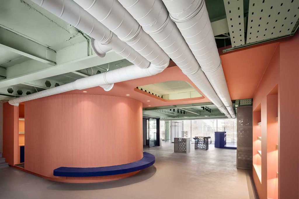
کاربر/بیمار وقتی در فضای انتظار مینشیند، روبهروی او پیشخوانی عریض و روشن قرار دارد که پذیرای اوست و پشت این میز جدارهای شیشهای نصب شده به رنگ زرد، گویی بازتابیست از نور بیرون.
در پلان اولیهی آشپزخانهای وجود داشت که با تغییراتی به محل قرارگیری تاسیسات دندانپزشکی تبدیل شد و خدمات آشپزخانه به پشت میز پذیرش انتقال پیدا کرد و به این صورت کشیدگی پذیرش حفظ شد و فضایی یکپارچه در سالن انتظار به وجود آمد.
در فضای درمان هم این یکپارچگی و بازتوزیع برابر نور با قرارگیری دیوارهی شیشهای نیمهشفاف بین اتاق پزشک و اتاق یونیت محقق شد.
با توجه به تاثیرات اثبات شدهی نور مناسب در بهبود روند درمان، برای ایجاد محیطی شفابخش و محیطی که کمترین تنش و اضطراب را به کاربر القا کند، توجه ویژهای به این مهم شد و با به کارگیری مصادیق حضورِ نور در فضای داخلی و تاکید بر آن سعی شد تا حق به نور برای کاربران فضا تا حد امکان بازپس گرفته شود.
کتاب سال معماری معاصر ایران، 1401
_______________________________________
نام پروژه: مطب دندانپزشکی دکتر بشردوست
عملکرد: درمانی
دفتر طراحی: گروه معماری روشن
معمار: روناک روشن گیلوائی
همکاران طراحی: کیانه قاسمپور، سعید حقدوست، مهآذر پولاب، کریم حاج عباسی، نازنین رئیسی
طراحی و معماری داخلی: روناک روشن گیلوائی
کارفرما: دکتر نازنین بشردوست
مجری: روناک روشن گیلوائی
مهندس تاسیسات: حامد دائمی، سعید بابایی
آدرس پروژه: رشت، گلسار، خیابان نواب، کوچهی اقاقیا، ساختمان هور
زیربنا: 65 مترمربع
کارفرما: دکتر نازنین بشردوست
تاریخ شروع و پایان ساخت: 1400
عکاس پروژه: Deed studio (اینستاگرام: deedstudio)
ایمیل: roshan.gilavaei@gmail.com
اینستاگرام: Ronak.roshan_g
Bashardoust dental office, Ronak Roshan Gilavae

Project Name: Bashardoust dental office
Function: Medical
Office: Roshan architecture group
Lead Architect: Ronak Roshan Gilavae
Design Team: Kianeh ghasempour, Saeed Haghdoost, Mahazar poulab, Karim hajabase, Nazanin raeisi
Interior Design: Ronak Roshan Gilavae
Client: Dr. Nazanin Bashardoost
Executive Engineer: Ronak Roshan Gilavae
Mechanical Installations Engineer: Hamed daemi, saeid babaei
Location: Rasht, Golsar
Area of Construction: 65 m2
Date: 2021-2022
Photographer: Deedstudio (Instagram: deedstudio)
Email: roshan.gilavaei@gmail.com
Instagram: Ronak.roshan_g
Statement/ The dental clinic’s interior design
Light is the continuation of life and the well-being of the body and the mind.
The proper distribution of light in medical facilities is of immense importance, but in the circumstance in which all matters are defined by class, even light is not distributed fairly. How can we reclaim light, essential to the healing process, in a neighborhood with a high floor to area ratio, a unit on the second floor of an apartment, at the end of a cul-de-sac?
Considering the project’s positioning,as well as the building’s façade, it was not possible to make changes in the proportions and the awning windows. Therefore, we decided to specifically define light for this space, through its examples. By opening the door at the entrance, the user will face a light that seems to fall from an outside source, dividing the space into two. In the user’s line of sight, green space has been placed; another representation of the presence of light, not as if plants were added to the space, but as if light has resulted in greenery blooming out of the wall, finding its way out.At the same time, this green is a partition between the waiting room and the restroom to create a private space. When the user heads towards the waiting room area, they will look over another source of light. Here, there was a window displaying a towering unattractive building that surrounded the area. We made this window semitransparent so that with suitable lighting it seems that light gently falls in the room from a faraway source and the pretentious neighboring building will not be visible.
As the user/patient is sitting in the waiting room,they will be fronting a broad and illuminated counter welcoming them. A glass screen has been installed behind this desk in the color yellow, seeming like a reflection of the light outside. In the primary plan, there was a kitchen which with some changes was transformed into the storing space for dental equipment. The kitchen facilities were moved behind the reception counter, maintaining the reception’s elongation, and a connected atmosphere in the waiting room.
The consistency and fair redistribution of light in the treatment area was achieved through the installation of a semitransparent glass wall between the doctor’s office and the unit room. Considering the proven effects of appropriate lightening in the improvement of the treatment process, special attention was paid to this crucial element, and by using and emphasizing examples of light in internal space, we tried to reclaim the user’s right to light as much as possible.


مدارک فنی


مطالب مرتبط