کاوش در یک فضای کاری با الهام از گذشته و حالوهوای گزینششدهی دههی ۸۰
Explore A Retro-Inspired Workplace With A Curated 80s Vibe

الهامهای طراحی برای فضای اداری جدید شرکت Panic در مرکز شهر پورتلند، از منابع متعددی سرچشمه گرفته است؛ شرکتی که توسعهدهندهی اپلیکیشنهای مک و همطراح کنسول بازی ویدئویی Playdate با رنگ زرد قناری و رویکردی طراحیمحور است.
«مدتهاست دربارهی اینکه زیباییشناسی فناوریِ رترو چگونه میتواند باشد، گفتوگویی مداوم داریم»، این را اندی هس، مالک و طراح داخلی Osmose Design توضیح میدهد؛ کسی که دفتر قبلی این شرکت را نیز ۱۰ سال پیش طراحی کرده بود.
«آنها میخواستند فضا روایتگر باشد. بهعنوان توسعهدهندگان اپ و گیمر، بهشدت به مفهوم Easter egg علاقهمندند و میخواستند این لایهی شوخطبعانه و کنایهآمیز را به زیباییشناسی فضا اضافه کنند. با این نگاه، شروع کردیم به ساختن یک داستان مشترک.»
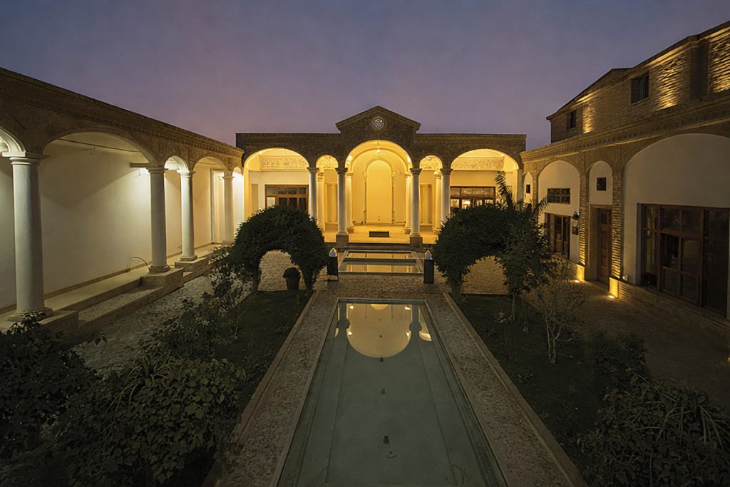
این داستان، روایتی خیالپردازانه از تاریخ شرکت است؛ روایتی که از مجموعهای از خاطرات واقعی و ساختگی تأثیر گرفته. ورودی دفتر از معماری مراکز خرید دههی ۱۹۸۰ الهام گرفته شده است؛ بهطور مشخص فروشگاه JCPenney در یکی از مناطق حومهای پورتلند. فضای پذیرش با آجرهای قهوهای خمیده، سرخسهای مصنوعی و یک بلندگوی صخرهایِ جعلی شکل گرفته که یک «میکس لابی دههی ۸۰» گزینششده را پخش میکند تا از همان ابتدا حالوهوا را بسازد. در مجاورت ورودی، اتاقی با پوشش پنلهای بتنی پیشساخته و شیاردار طراحی شده که همچون پناهگاهی بروتالیستی عمل میکند و میزبان ویدیوی معرفی شرکت است؛ فضایی الهامگرفته از تجربههای پیشنمایش مدرن در ابتدای وسایل شهربازی.
Explore A Retro-Inspired Workplace With A Curated 80s Vibe
Design inspiration came from a myriad of sources for the new downtown Portland office space for Panic, Mac app developer and co-designer of Playdate, a canary yellow, design-forward video game console. “We have had an ongoing conversation around what a retro tech aesthetic could look like,” explains owner and interior designer of Osmose Design, Andee Hess, who also designed the firm’s prior office 10 years ago. “They wanted the space to tell stories. As app developers and gamers, they are very much about the Easter egg, and wanted to bring that tongue-in-cheek layer to the aesthetic. With that in mind, we started to build a story together.”
The story is a fantastical narrative of the company’s history, influenced by a collection of real and fabricated memories. The entrance to the office is inspired by 1980s mall architecture, specifically, the JCPenney’s at a suburban Portland locale. The curved brown brick reception area features artificial ferns and a faux rock speaker broadcasting a curated “80s lobby mix” to set the tone. Just off the entrance, a room clad in prefabricated raked concrete panels was designed as a Brutalist bunker to host an introductory video to the company, inspired by modern pre-show intro experiences at amusement park rides.

Osmose Design این فضای کاری پورتلندی را با حالوهوایی قدیمی و نوستالژیک شکل داده است
فضای پذیرشِ پوشیده از آجر با بازیِ آگاهانه با متریالها، حس نوستالژی را تقویت کرده و لحن کلی فضا را مشخص میکند. هنرمندی در محل حضور یافت تا لوگوی Panic را مستقیماً روی آجرهای Belden حک کند؛ رویکردی دستساز و صنعتگرانه که به گفتهی هس، یکی از محبوبترین بخشهای پروژه برای اوست. طراح و کارفرما تصمیم گرفتند کفهای بتنی اکسپوز موجود را حفظ کنند و چهار استوانهی بتنی با محافظهای نوری آکریلیکِ سفارشی درون آنها اضافه کنند تا «سکوی تلهپورت» شکل بگیرد؛ ارجاعی همزمان به Star Trek و پرتاب شاتل فضایی. هس میگوید: «نوعی اشارهی سوررئال به چیزهایی که دقیقاً نمیتوانی نامشان را بگذاری.»
از جمله فضاهای شاخص با تمرکز بر کارکنان میتوان به اتاقهای استراحت با نورگیرهای مصنوعی، اتاقهای تست بازی و فضایی با پلکان استادیومی الهامگرفته از conversation pit اشاره کرد؛ جایی برای گردهمایی کارکنان یا صرفاً فاصله گرفتن از میز کار. این فضا، و در واقع کل دفتر، از فیلتر «نیکوتین» عبور داده شده است؛ مفهومی که به هدایت پالت رنگی کلی و تقویت حس نوستالژیک محیط کمک کرده است.
Osmose Design Tailors This Portland Workplace With Old-School Flair
The brick-covered reception area plays with materials to create a sense of nostalgia and set the tone. An artist came on site to etch Panic’s logo into the Belden brick. It is a handcrafted artisanal approach that remains one of Hess’s favorite pieces of the project. The designer and client chose to keep the existing exposed concrete floors, adding four concrete cylinders with custom inset acrylic light shields to create a “teleportation pad” (referencing both Star Trek and a Space Shuttle launch). “Kind of a surreal nod to things that you can’t quite put your finger on,” says Hess. Employee-focused highlights include break rooms with fake skylights, game testing rooms, and a conversation pit-inspired stadium stair seating area that serves as a spot for employees to gather—or just step away from their desks. This space, and the entire office, has been “run through a nicotine filter,” a concept that helped direct the overall color palette and enhance this nostalgia-evoking environment.

گردشی در دفتر متفاوت Panic؛ طراحیشده توسط Osmose Design
ابر آکوستیک معلق با لبههای پخخورده، با نمدی به رنگ جو دوسر و با تهمایهی «نیکوتینی» از برند Turf پوشانده شده و بهگونهای طراحی شده که همچون یک عنصر معماری شبیه به دال بتنی احساس شود. پلکان استادیومی از تجمع کارکنان پشتیبانی میکند و فضایی برای فاصله گرفتن موقت از میزهای کار فراهم میآورد. در آشپزخانهی دفتر، تیم طراحی از فضای Carl’s Jr. الهام گرفته است. پنلهای سفید که بهعنوان تختهمنو در نظر گرفته شدهاند، حالتی تا حدی سوررئال و حتی وهمآلود به فضا میدهند. کاشیهای کف از مجموعهی Summitville Strata Tile انتخاب شدهاند تا بیشترین شباهت را به کفپوشهای Carl’s Jr. داشته باشند. در نزدیکی ورودی، اتاقی شبیه به پناهگاه بروتالیستی، پوشیده از پنلهای بتنی خاکستری پیشساخته از Concrete LCDA، برای نمایش ویدیوی معرفی شرکت طراحی شده است؛ مشابه ویدیوهای پیشنمایش پیش از سوار شدن به وسایل شهربازی. سقفهای آینهای، ادای احترامی به فروشگاههای کامپیوتری مراکز خرید دههی ۱۹۸۰ هستند. گرافیک زیگزاگی از دفتر قبلی شرکت به این فضا منتقل شده و بخشی از هویت بصری برند محسوب میشود. چهار استوانهی بتنی، «سکوی تلهپورت» را شکل میدهند؛ ارجاعی به Star Trek یا پرتاب شاتل فضایی، با محافظهای نوری آکریلیک سفارشی. این نورها قابل برنامهریزی هستند و برای ایجاد فضایی بازیگوشانه، زمانی با یک اختلال عمدی تنظیم شده بودند تا «حس گرم شدن برای پرتاب» را القا کنند، به گفتهی هس. در پسزمینه، انبوهی از قوطیهای بنفش در یک فرورفتگی دیوار، Easter egg دیگری است: نوشیدنیای جعلی از یکی از بازیهای Panic. دیوار منحنی با پوشش رنگ پودری، مسیر دسترسی به سرویسهای بهداشتی را هدایت میکند.
Walk Through Panic’s Far Out Office By Osmose Design
The beveled hanging acoustic cloud is wrapped with an oatmeal colored “nicotine-tinged” felt material by Turf and designed to feel like a concrete slab architectural feature. The Stadium Stairs support employee gatherings and provide a place for employees to step away from their desks. For the office kitchen, the team channeled Carl’s Jr.’s White panels planned as menu boards give the space a somewhat surreal and eerie effect. The floor tiles from Summitville Strata Tile were chosen to closely match the flooring at Carl’s Jr.. Just off the entrance, a Brutalist bunker-like room clad in prefabricated gray concrete panels by Concrete LCDA is designed to host an introductory video to the company, similar to the pre-show intro experience videos before amusement park rides. The mirrored ceilings are an homage to 1980s mall computer stores. The chevron graphic is picked up from their previous office and is part of the company’s branding. Four concrete cylinders form a “teleportation pad” a reference to Star Trek or a Space Shuttle launch and feature custom inset acrylic light shields. The lights are programmable and as a playful atmosphere-adding element, were once programmed with a glitch, “to feel like you are warming up for a launch,” says Hess. At the back, a stack of purple cans in a cove is another Easter egg; a fake beverage from one of Panic’s games. A powder-coated curved wall leads to the bathrooms.


مطالب مرتبط